7 strategic things you must include in your website footer
This post may contain affiliate links. I may receive a commission for purchases made through these links (at no cost to you!)
The website footer is like the red-headed stepchild of web design. It gets neglected and unfairly so. Your footer shows up on every page of your site - working overtime on navigation and sought after when a legal issue comes into play.
I mean, think about it, we all use them and quite a lot.
How many times have you thought, "Gee, I wonder what their return policy is?" And then headed straight for the bottom of the page to look for a link. Or "Oh, I wonder if they're open today?" And once again, headed for the bottom of the page to look for store hours.
Precisely.
The footer is essential to your overall site's performance and ought to be thought of strategically to employ its true potential. In this post, I'm sharing the seven things you must have in your website footer to do just that.
1. Main & secondary navigation
Counterintuitive, since they're already at the top, your main navigation also needs to live in your footer. Long, scrolling, bottomless pages are more and more common and encouraged these days. But, if your website visitor somehow manages to make it to the bottom of your mini-novel, they need a lifeline to make their way out and back to your, oh, let's say, paid services. So putting your best links at the top AND bottom is muy importante.
Your main navigation needs to be simple and easy to understand as well - limiting the coveted position to just five or less. Therefore most of your "extra" links need to be housed in your footer—an excellent place for your job applications, return policy, and that link to your cat's Instagram bio.
2. Search bar
If your potential customer hasn't yet found what they're looking for in your library of links, then they'll head straight for the search bar. Why not make it easy for them and slap one right into the footer. This will save them hours of scrolling, especially if you have a lot of content to sift through - keeping them on the site for longer.
Because if you can't find something in 2 seconds or less... "Bye, Felicia."
3. Social links
I've mentioned this in my other posts before, but I'll reiterate. Your social links don't belong in your main navigation. Learn more from this blog post here: 5 mistakes you're making with your website and how to fix them.
You've spent all of your time and energy directing website visitors from your Facebook and Instagram accounts to your website. You don't want them to see your social pages above the fold and then immediately leave again.
While you can be strategic about your social link placement in many places on your site, the footer is an excellent spot for them to go. In fact, if you have an Instagram account, this is a fantastic spot to give your visitors a little visual preview of your content by importing your feed. Nothing glams up a footer more than some beautiful photography.
4. Contact info
If you own a brick and mortar business, your physical location must be in the footer. Not only will it help customers to find you, but it is most often where they will go to look for it.
Other important contact information can live here as well. Feel free to include your email, phone number, hours of operation, or even a contact form if it makes sense for your business.
Curious about Squarespace here's a link to try it for yourself. Save 10% off your first subscription of a website or domain by using code PARTNER10. (Yes, that's an affiliate link!)
5. Freebie or Newsletter Opt-in
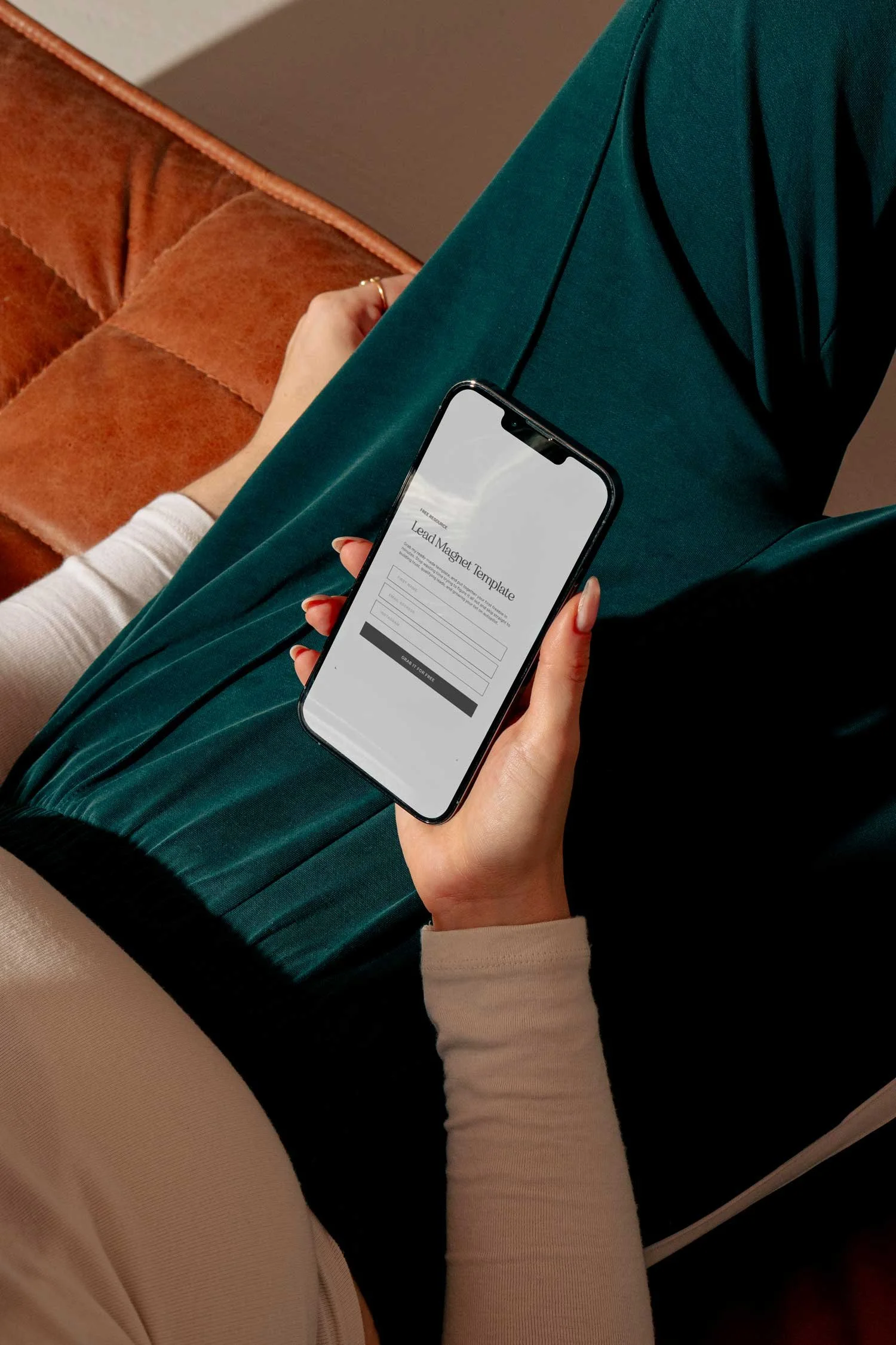
Building an email list is one of the most effective ways to gain a loyal following. Placing an opt-in, or better yet, a sweet freebie in your footer assures that website visitors will see it on every page of your site - increasing the chances that they will sign up and get on the list.
It can be as simple as a few name collection boxes, or if you want to get fancy, create a graphic to go with it. I like to use Smartmockups for quick and easy mockup design, perfect for those downloadable PDFs.
6. Legal pages
This is non-negotiable. Your legal pages need to be accessible from every page on your site and easy to find. Right at the bottom of your footer is an excellent place for them to go.
What do I mean by legal pages? This is where you'll house your privacy policy, terms and conditions, disclaimers, and any other "contract" you'd like for your website visitors to see.
7. Copyrights & credits
Along with your legal pages, you'll want your business's copyright and date. This little symbol © essentially tells everyone who lands on your site that you stake claim to the content—sort of like putting a flag on your territory-and the date lets them know that it currently applies. It'll look something like this ©yourbusinessname 2021.
Any credit that is due can go right along with it, such as a photographer or website designer. Simply add their name and link to their site or portfolio.
Need help bringing your creative vision to life?!
I know how overwhelming it can be to start your online business. That's why I decided to create a simple and easy process. Together we’ll build a stunning website that you can launch in just two weeks!
Book your free consultation call today! Chat with me about your website goals and together we’ll navigate the best solutions for your business.


