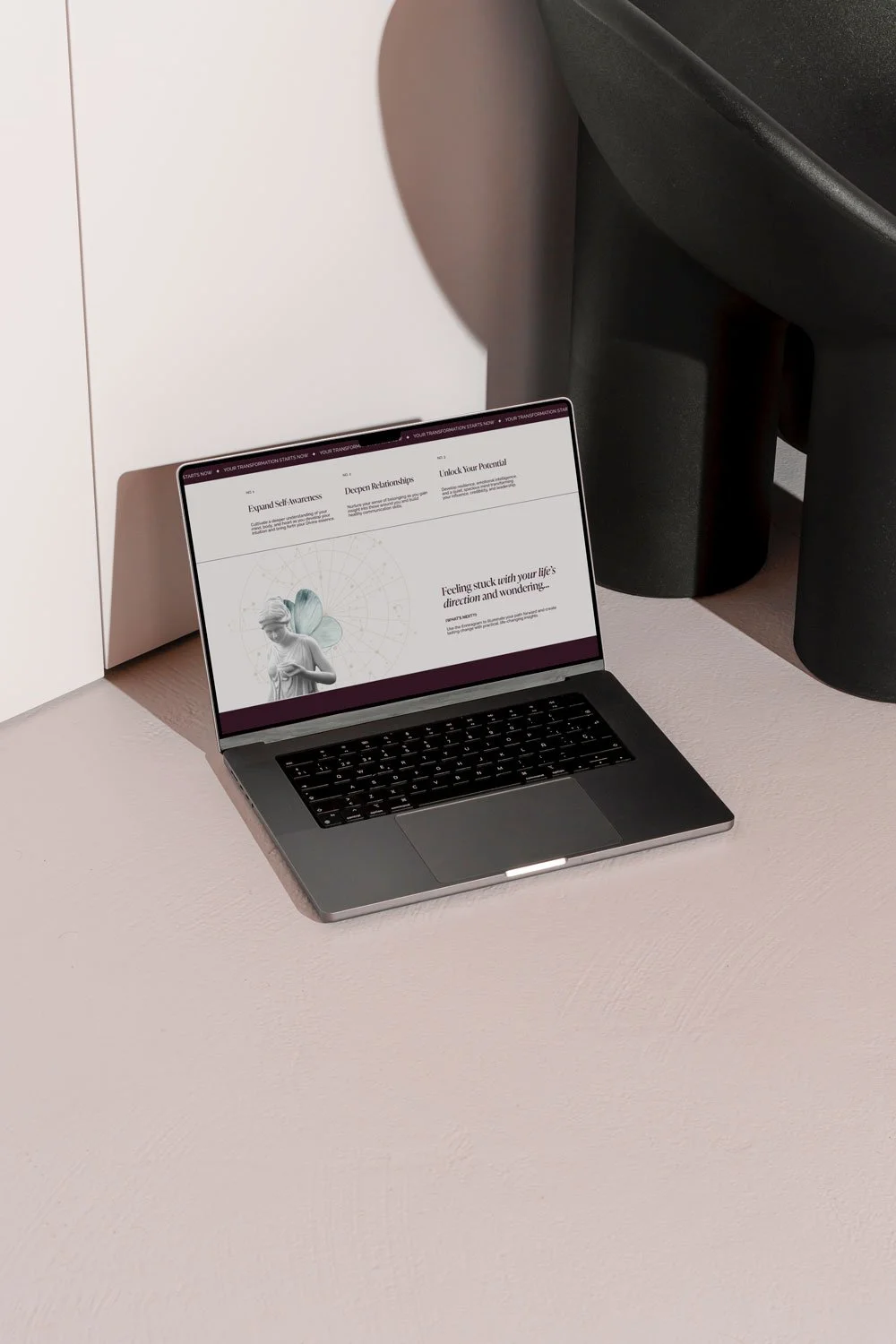
Best Squarespace Therapist Website Examples for Inspiration
Tired of the typical boring therapist website? Dive into these fresh, unique designs that show off personality, vibe, and style—proving therapy sites can be anything but basic.
How to create an opt-in freebie for your online business
Creating an opt-in freebie is an essential step in any online business. It's how you grow an email list, which, if you don't already know, is a pretty big deal! Your email list is…
5 mistakes you’re making with your coaching website and how to fix them
As a Squarespace website designer, I know firsthand how many nuances there are in creating an exceptional site for your business. And if you're trying to DIY one on your own, then there is a…
6 Signs That Your Business Is Ready For a Website
Wondering if it's time to take the leap and finally invest in a professional website for your business? Pay close attention to these 6 signs my friend - this may be your year.
The 7 essential pages to have on your website
Creating a website for the first time can be an "Oh shit" moment in more ways than one. There's a lot to think about when it comes to design, photos, text, layout... the list goes on and on. But today, I'm giving you some basic blueprints when building your site that will take the headache out of the process. Your website needs to be built with the foundations of these seven essential pages. I'm going to walk you through each one step-by-step, and hopefully, you'll have a better picture of the overall plan when we're through.
7 strategic things you must include in your website footer
The website footer is like the red-headed stepchild of web design. It gets neglected and unfairly so. Your footer shows up on every page of your site - working overtime on navigation and sought after when a legal issue comes into play. I mean, think about it, we all use them and quite a lot. How many times have you thought, "Gee, I wonder what their return policy is?" And then headed straight for the bottom of the page. Or "Oh, I wonder if they're open to today?" And once again, headed for the bottom of the page. Precisely. The footer is essential to your overall site's performance and ought to be thought of strategically to employ its true potential. In this post, I'm sharing the seven things you must have in your website footer to do just that.
When you should DIY your site vs. hiring a website designer
DIYing your website is an amazing experience. I wish every business owner could have the chance to do it. But not every entrepreneur or business is in a place for the job. That's why I've compiled some tips for you on why you might want to DIY your site vs. hiring a website designer. Neither is good or bad. It just depends. Whether you're a first-time online business owner or you've had skin in the game for a while, there are some pros and cons to weigh. Read on to find out which camp you're in! And then get that website ball rolling, my friend, because it's time to be online, like yesterday.
Why a professional website matters and the facts to prove it
"Where can I find you online?" If you're a business owner in, then there is no skirting this question. Everyone and their mom has a Facebook page, Twitter account, or TikTok presence. And your business is no different. But the real question is... "Do you have a professional website?"


